As always, Our World in Data really sets a benchmark on how informative journalists should be:
https://ourworldindata.org/coronavirus
Impressive.
Like, yes, that's way too much information for the average citizen to digest, but… have a question like "hey, what are the symptoms"? Here you go, in a chart:
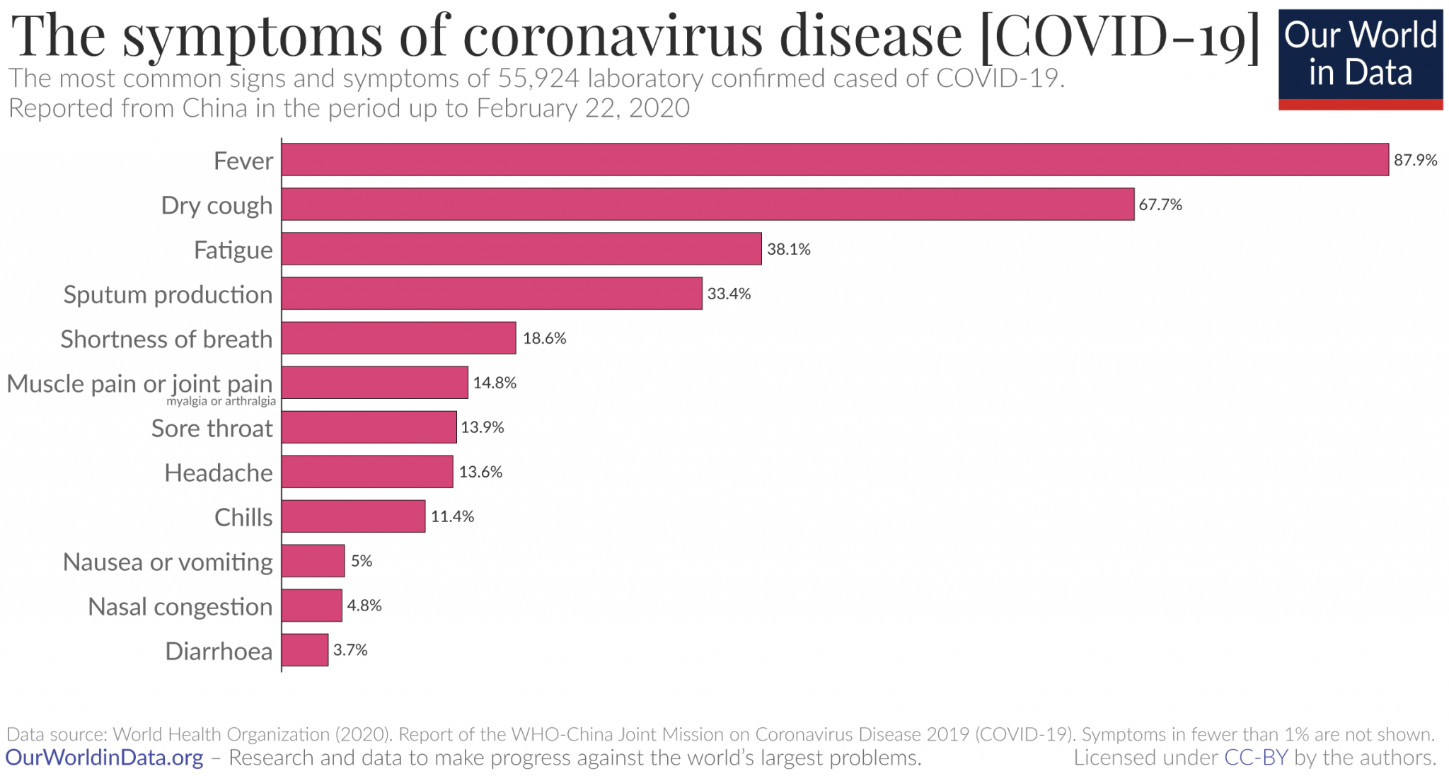
Much better than the press's typical "common symptoms include blah blah blah". Got a fever? Could be COVID-19! Got vomiting or diarrhea? Probably not COVID-19.
But, yes, the Ars article also looks pretty damn good!