Quote:
Originally Posted by Dorian Gray

Here’s mine:
The yellow/orange Wallpaper contrasts nicely with my black iPhone 5. |
I like that background. I've made my own for so long, I don't think I've even looked to see what's available, stock, in iOS 7 and 8...I might be surprised.
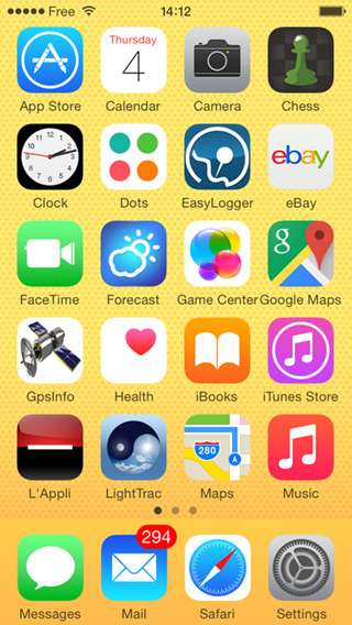
Quote:
Originally Posted by Dorian Gray
Currently (for the last three months or so) I’ve kept my apps in alphabetical order. Not sure if I like that or not – when I add an app beginning with ‘A’, all the apps after it get moved, which means hunting for them. But at least I know roughly where to hunt for them, since they’re alphabetically arranged.
|
I dabbled with that arrangement as well, several years ago. I could never quite get comfortable with it (which is weird, because I'm a bit of a neatness/order freak, and tend to
love things being in alphabetical or numerical order anywhere else!

I do have them ordered alphabetically within their specific groupings/clusters below.
My apps are grouped together my purpose/function (as much as possible...some of these recent editions make it tougher than before, and I'm often tweaking/finessing it), and that's the way I've done it for 3-4 years now (maybe longer).

Row 1: Dual, two-app clusters re: photography and travel/navigation
Row 2: All my media...purchased, downloaded, etc. Anything I play, listen to or watch
Row 3: The various stores (or places I get much of the above from)...paired the two blatant "store" ones together, and then the two reading/publication-oriented ones as well
Row 4: Health and Passbook seem similar in purpose/function (a gathering place for similar info/function), Stocks and Weather original iOS widgets (I've always had them side-by-side)
Row 5: FaceTime (at bottom, near all the other communication apps), all my PDA-oriented stuff in a folder, the new Tips and I've always kept Settings in the lower right corner of my homepage
Home dock: phone, texting, email and Internet (if there was room for five icons, FaceTime would go here too). I sometimes think about putting FaceTime down here in place of Safari, then my entire bottom dock is all communication-oriented apps. But the idea of three green icons and one blue one bothers me.
Most of the above, I've had it this way on my iPhone since 2010 (or earlier), so it's all automatic and no-brainer now (I've always put the camera and photo apps together in the upper left corner, always had the compass and maps apps in the upper right, etc.). I don't even really have to look. But Health and Tips have entered the mix recently, so it's kinda thrown off my mojo. I still tweak my fourth and fifth row, trying to find a better, sensible arrangement.
I'm already thinking ahead to next year and how I'll have it all on my iPhone 6s.

(mostly like the above, except I'll have an extra row available so I'll probably bring my non-stock Apple apps folder over from my second page and maybe break a few things out from the PDA folder (or maybe iOS 9 will introduce another stock app or two?
That's just kinda sad, I realize.
It still amazes me, after all the talk more than a year ago for iOS 7 about unifying, etc. just still, even in iOS 8, what a disparate mishmash of styles and approaches are still present in the iOS icons. Gradients going different ways, some apps use clean white symbols/glyphs, while others use smaller, more cluttered images (I despise the Newsstand icon, but not nearly as much as I do Game Center, Photos and Passbook).
It truly looks like about 3-5 different groups within Apple worked on the icons, never sharing their progress or ideas among one another, and that they only see the work of the others when it's all revealed at WWDC.
